Step 4 - UI
When building the UI, it's useful to see the fields available on the JSON payload so we can choose which ones we want to display to the user. We can easily generate the TypeScript interfaces describing the response object using a free online JSON to TypeScript interface converter (we did this step for you below).
Dictionary types
Create a new file in the src directory called models.ts.
 ┣ 📂 src
 ┃ ┣ models.ts
Open the file and paste in the TypeScript interfaces:
export interface License {
  name: string;
  url: string;
}

export interface Phonetic {
  audio: string;
  sourceUrl: string;
  license: License;
  text: string;
}

export interface Definition {
  definition: string;
  synonyms: string[];
  antonyms: string[];
  example?: string;
}

export interface Meaning {
  partOfSpeech: string;
  definitions: Definition[];
  synonyms: string[];
  antonyms: string[];
}

export interface WordData {
  word: string;
  phonetics: Phonetic[];
  meanings: Meaning[];
  license: License;
  sourceUrls: string[];
}

export interface GroupedDefinition {
  word: string;
  phonetic: Phonetic | undefined;
  partOfSpeech: string;
  meanings: Meaning[];
}
The WordData interface describes the main JSON response object from the API. Now go back to the selected_text_dictionary.tsx and update the type of the wordData state variable to WordData | null. Remember to import the WordData interface from models.ts.
...
import { WordData } from "../models";

function SelectedTextDictionary() {
  const plugin = usePlugin();

  // This stores the response from the dictionary API.
  const [wordData, setWordData] = React.useState<WordData>();

  ...
}
UI Component
Let's create a component to view the WordData response from the dictionary API. Create a new sub-directory in the src folder called components and add a new file called PreviewDefinitions.tsx:
 ┣ 📂 src
 ┃ ┣ 📂 components
 ┃ ┣ ┣  📜 PreviewDefinitions.tsx   - New UI component file
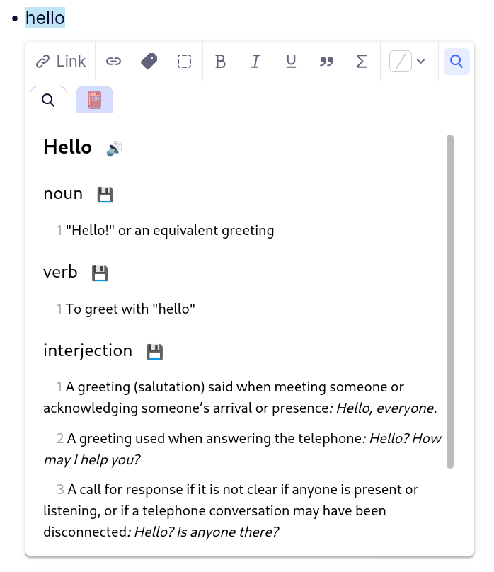
Below we've created a sample UI which allows users to preview the various matching defitions for the words as well as the pronunciation. There is also a save button to the right of each definition which doesn't do anything yet, but will be used in the next part of the tutorial to add the definitions into RemNote. Feel free to change the styling however you wish! Here we are using tailwind CSS to style our components. The plugin template automatically comes with tailwind installed.
import React from 'react';
import { WordData, GroupedDefinition } from '../models';

function capitalize(s: string) {
  return s.charAt(0).toUpperCase() + s.slice(1);
}

const groupBy = <T, K extends keyof any>(list: T[], getKey: (item: T) => K) =>
  list.reduce((previous, currentItem) => {
    const group = getKey(currentItem);
    if (!previous[group]) previous[group] = [];
    previous[group].push(currentItem);
    return previous;
  }, {} as Record<K, T[]>);

interface WordPreviewProps {
  wordData: WordData;
  onSelectDefinition: (d: GroupedDefinition) => void;
}

export const PreviewDefinitions: React.FC<WordPreviewProps> = (props) => {
  const { word, phonetics, meanings } = props.wordData;
  const phonetic = phonetics[0];
  const audio = phonetic?.audio;
  const groupedMeanings = groupBy(meanings, (x) => x.partOfSpeech);
  return (
    <div>
      <div className="flex flex-row items-center mb-4">
        <div className="mr-3 text-lg font-semibold">{capitalize(word)}</div>
        {audio && (
          <div
            className="w-4 h-4 cursor-pointer"
            onClick={() => new Audio(audio).play()}
          >
            🔊
          </div>
        )}
      </div>
      {Object.entries(groupedMeanings)
        .map(([partOfSpeech, meanings]) => (
          <div className="mb-4">
            <div className="flex flex-row items-center mb-3">
              <div className="text-base font-medium mr-3">{partOfSpeech}</div>
              <div
                className="w-4 h-4 cursor-pointer"
                onClick={() =>
                  props.onSelectDefinition({
                    word,
                    phonetic,
                    meanings,
                    partOfSpeech,
                  })
                }
              >
                💾
              </div>
            </div>
            {meanings.map((meaning) =>
              meaning.definitions.map((def, idx) => (
                <div className="mb-2">
                  <span className="text-gray-400 ml-3">{idx + 1}</span>{' '}
                  <span className="font-medium">
                    {def.definition.replace(/\.$/, '')}
                  </span>
                  {def.example ? <span className="italic">: {def.example}</span> : ''}
                </div>
              )),
            )}
          </div>
        ))
        .flat()}
    </div>
  );
};
After creating the UI component, go back to selected_text_dictionary.tsx and modify the SelectedTextDictionary component to use the new PreviewDefinitions component we created:
function SelectedTextDictionary() {

  ...

  return (
    <div className="min-h-[200px] max-h-[500px] overflow-y-scroll m-4">
    {
      wordData && (
        <PreviewDefinitions wordData={wordData} onSelectDefinition={() => {}} />
      )
    }
    </div>
  )
}
We'll leave the onSelectDefinition callback blank for now.
Don't forget to try out the new UI! If you still have the plugin running from the test we did earlier, the plugin should have automatically refreshed itself in response to the changes you made. Otherwise you will need to open a new terminal inside the plugin folder, and run:
npm run dev