Custom CSS
Overview
We support multiple ways of creating and sharing Custom CSS.
- The Custom CSS Powerup allows you to apply custom CSS directly to your knowledge base by navigating to the Custom CSS Powerup page.
- CSS Snippet and Theme plugins allow you to register custom CSS in a snippet.css or theme.css file and can be downloaded from the Plugin and Theme Marketplaces, respectively. Snippet plugins may optionally support commands and settings, while Theme plugins do not support any JavaScript code.
Below there are a series of guides which explain how to create and share CSS.
Designing Custom CSS with the "CSS Selector Helper"
Use the CSS Selector Helper to easily find CSS.
View the demo: https://www.loom.com/embed/f46a5a0fef4c4bb6ac23995c882d145a
Uploading a Snippet
Let's suppose you have some CSS styles you created using the CSS powerup code block and you want to share your CSS in the simplest way possible, without messing around with any JavaScript. This guide is for you. If you are familiar with GitHub, you can use our simple snippet template. Otherwise the guide below assumes no knowledge of GitHub.
Create the snippet.css file
Copy the CSS code from the CSS powerup code block into a new file called snippet.css.
Create a manifest.json file
Create a manifest.json and copy and paste the text below. Replace the uppercase words like "YOUR_SNIPPET_ID" with your own values.
{
  "manifestVersion": 1,
  "id": "YOUR_SNIPPET_ID",
  "name": "YOUR_SNIPPET_NAME",
  "author": "YOUR_NAME",
  "repoUrl": "",
  "version": {
    "major": 0,
    "minor": 0,
    "patch": 1
  },
  "theme": [],
  "enableOnMobile": false,
  "description": "YOUR_SNIPPET_DESCRIPTION",
  "requestNative": false,
  "requiredScopes": [
    {
      "type": "All",
      "level": "Read"
    }
  ]
}
Create a README.md file
Create a markdown file called README.md and describe what your CSS styles do. This will be displayed in the plugin marketplace when users click on your snippet.
Zip the three files and upload
Zip the snippet.css, README.md and manifest.json file into a zip file. Then go to Plugins and Themes in RemNote and click on the Build tab. Finally, click on the "Upload Plugin" button and upload the zip file.
Creating a Snippet Plugin
If you have a slightly more complicated plugin which involves settings or commands, then you probably want to use a snippet plugin.
Setup your development environment
You'll need the following software to start developing:
1. Node.js
We will use Node.js to build the plugin.
2. A GitHub Account
We will use GitHub to create a repository for our plugin project based on the template plugin.
3. Git
You will also need to install Git. Check the official guide with instructions for each operating system.
4. An IDE or text editor
We recommend using Visual Studio Code, but any other IDE or text editor will work.
Setup the snippet template
The snippet template is a public Git repository which comes preconfigured with the correct plugin directory structure and default settings so you can skip the boilerplate and focus on implementing your ideas!
Clone the template
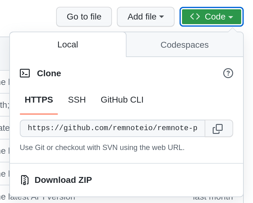
- Navigate to the main page of the snippet template repository on GitHub.
- Click on the "Use Template" button.
- Fill out the repository information.
- Click on the Clone or download button.
- Press "HTTPS".
- Copy the link.
- Open a terminal in the directory where you want to clone the repository.
- Run
git clone <link>to download the template repository.
Test-run the template
Open your terminal of choice and navigate into the folder of the repository you just cloned.
Then run:
npm install
This will install a very minimal React App, along with the RemNote plugin SDK (software development kit).
Generate the manifest
Inside the plugin folder, run:
npx remnote-plugin init
This will prompt you for some information which will get automatically saved to the manifest.json metadata file.
Create a README
Inside the plugin folder, create a README.md file. Don't worry about filling it out yet.
Create your snippet plugin
You can develop the styles for your theme inside RemNote by navigating to the Custom CSS powerup Rem and clicking on the "Add Blank CSS Block" button. Styles you add to the CSS code block will be globally applied as you edit. When you are finished you can copy them into the src/snippet.css file and reload the plugin. You can add settings and commands to allow the user to customize the CSS styles while it's running, take a look at the src/index.tsx file in the snippet template for inspiration.
Test the plugin works
- Run
npm run devin the plugin folder. - Open RemNote, go to Plugins and Themes in the Settings modal.
- Click on the Build Tab.
- Press Develop from Localhost and press enter.
- Check that the styles you added are applied correctly
Upload to the Store
Once you are happy with your CSS snippet plugin you can upload it to the plugin marketplace by:
- Run
npm run buildto generate the PluginZip.zip file. - Go to Plugins and Themes in RemNote and click on the Build tab.
- Click on the "Upload Plugin" button and upload the PluginZip.zip file.
Creating a Theme
Themes are used for large restylings of the app. Only one theme is activated at a particular time. Themes can support dark mode, light mode or both.
Setup your development environment
You'll need the following software to create a theme:
1. A GitHub Account
We will use GitHub to create a repository for our theme based on the template theme.
2. Git
You will also need to install Git. Check the official guide with instructions for each operating system.
Setup the theme template
Our theme template is a public Git repository which comes preconfigured with the correct theme directory structure and default settings so you can skip the boilerplate and focus on implementing your ideas!
Clone the template
- Navigate to the main page of the theme template repository on GitHub.
- Click on the Clone or download button.
- Press "HTTPS".
- Copy the link.
- Open a terminal in the directory where you want to clone the repository.
- Run
git clone <link>to download the template repository.
Create your theme
You can develop your theme inside RemNote by navigating to the Custom CSS powerup Rem and clicking on the "Add Blank CSS Block" button. Styles you add to the CSS code block will be globally applied as you edit.
Upload to the Store
Once you are happy with your theme, you can copy the CSS code from the code block and paste it into the theme.css file. Create a README.md file to describe your theme and don't forget to include some pictures of what it looks like. Then zip the folder and upload it by clicking on the "Upload Theme" button in the Theme Marketplace build tab.
CSS Classes
We offer stable external CSS classes that plugins can target. We'll make sure maintain these classes even if our internal code changes to enable stable external themes.
To help organize our custom CSS classes, we are using a CSS naming convention known as the BEM (Block, Element, Modifier) system.
- Blocks are standalone entities which don't depend on other elements for their meaning, eg:
rn-doc-header - Elements are parts of a block and have no meaning by themselves. Elements are tied to their parent blocks. eg:
rn-doc-header__sourceandrn-doc-header__tag. - Modifiers are flags on blocks or elements which indicate a change in appearance, behavior or state. eg:
rn-doc-header__source--webandrn-doc-header__source--pdf.
We also use a set of design tokens to allow you to easily change global CSS values for colors, fonts and light/dark mode.
Each design token is named as follows:
rn- <category> - <property> - <role> ‒- <state>
Below you can browse our current list of CSS blocks. Those with nested elements or modifiers can be expanded by clicking on them.
Noticed anything missing? Need some extra functionality which our current collection of classes can't provide? Don't hesitate to make a feature request on our new feedback site.
Global Theming Classes
.rn-clr-backgroundBackground color..rn-clr-background-light-accentLight accent background color..rn-clr-content-secondarySecondary color for content (text)..rn-clr-background-accentBackground accent color..rn-clr-content-on-color.rn-clr-background-secondarySecondary background color..rn-clr-background-primaryPrimary background color..rn-clr-content-primaryPrimary content (text) color..rn-clr-content-accentAccent content (text) color..rn-clr-background-elevation-10Background elevation.rn-clr-content-tertiary.rn-clr-content-state-disabled.rn-clr-background-tertiary.rn-clr-border-selected.rn-clr-border-opaque.rn-clr-background-overlay-dark.rn-clr-shadow-elevation-10.rn-clr-content-inverse-primary.rn-clr-border-light-accent.rn-clr-background-light-positive.rn-clr-background-light-warning.rn-clr-content-warning.rn-clr-background-elevation-5.rn-clr-background-inverse-primary.rn-clr-background-warning.rn-clr-content-negative.rn-clr-background-state-disabled.rn-clr-background-inverse-secondary.rn-clr-content-positive.rn-clr-content-state-warning.rn-clr-shadow-default.rn-clr-shadow-card.rn-clr-shadow-menu.rn-clr-shadow-modal.rn-clr-shadow-elevation-30.rn-clr-border-state-disabled.rn-clr-border-negative.rn-clr-background-elevation-20.rn-clr-background-overlay-light.rn-clr-shadow-elevation-5.rn-clr-content-logo-color.rn-clr-background-elevation-30.rn-clr-background-elevation-50.rn-clr-content-inverse-secondary.rn-clr-content-inverse-tertiary.rn-clr-border-inverse-opaque.rn-clr-border-inverse-selected.rn-clr-background-negative.rn-clr-background-positive.rn-clr-background-light-negative.rn-clr-background-always-dark.rn-clr-background-always-light.rn-clr-content-on-color-inverse.rn-clr-border-accent.rn-clr-border-accent-light.rn-clr-border-warning.rn-clr-border-positive.rn-clr-background-elevation-15.rn-clr-background-elevation-40.rn-clr-background-elevation-60.rn-clr-background-elevation-70.rn-clr-background-elevation-80.rn-clr-background-elevation-90.rn-clr-background-elevation-100.rn-clr-shadow-elevation-15.rn-clr-shadow-elevation-20.rn-clr-shadow-elevation-40.rn-clr-shadow-elevation-50.rn-clr-content-second.rn-clr-shadow-close-keyboard-menu.rn-clr-background-logo-color.rn-clr-content-pirmarySemantic Classes
.rn-plugin-sidebarPlugin sidebar..rn-plugin-listList of plugins..rn-pluginPlugin card within the plugin sidebar..rn-card3Generic card component..rn-doc-header7Document header including the document top bar, document title, sources bar and tags bar..rn-doc-titleTitle of a document..rn-queue10Inner queue container..rn-queue-containerOuter queue container, including the floating exit queue button and the inner queue container.rn-tag3Targets tags in the editor..rn-tag-containerContainer for tags in the editor..rn-editor22Hierarchical Rem editor and all of its containing Rem..rn-search-portal1Search portal container..rn-settings18Settings modal..rn-all-notes11Container for the entire all notes content..rn-doc-menuDocument menu popup..rn-checkboxGeneric checkbox component used throughout the app..rn-pane4Container for the window pane..rn-omnibar7The Omnibar popup window..rn-rem-bulletRem bullet..rn-menuGeneric popup menu window..rn-labeled-button.rn-card-delimiter.rn-add-rem-button.rn-rem-icon-bullet1.rn-popup2.rn-rem-stack-arrow.rn-popup-background.rn-button.rn-search2.rn-switch-handle.rn-dialog-background.rn-dialog.rn-dialog-overlay.rn-job-indicator-button.rn-code-node3.rn-navigation-bar.rn-cloze-button.rn-pdf-viewer1.rn-ctrl-f1.rn-delete-button.rn-add-document-to-folder.rn-practice-rem-in-this-folder.rn-search-button.rn-rem-reference.rn-help-button.rn-divider.rn-account-capsule.rn-nav-tab-button.rn-day-with-rem.rn-document-preview.rn-queue-remA bullet-point Rem in the queue..rn-table-headerA table header..rn-search-portal-query.rn-bullet-containerA RemNote bullet..rn-table-row.rn-table-row-menu.rn-list-number.rn-sidebar-counter.rn-plugin-rootRepresents the DOM mount node for a plugin.rn-progress-bar.rn-date-header-item.rn-flashcards-edit3.rn-primary.rn-page-header-mobile.rn-plugin-logo.rn-mobile-sync-status.rn-article-header1.rn-question-remThe Rem which represents the flashcard question, excluding its ancestors..rn-omnibar-button.rn-background-toolbar.rn-document.rn-edit-later.rn-add-button.rn-sidebar-flashcards-link.rn-list-number-wrapper.rn-editor-container.rn-quote.rn-quote-inner.rn-text-heading-xsmall.rn-text-heading-small.rn-text-heading-medium.rn-text-heading-large.rn-text-label-subheading.rn-text-label-small.rn-text-label-medium.rn-text-label-base.rn-text-label-large.rn-text-label-xlarge.rn-text-paragraph-small.rn-text-paragraph-medium.rn-text-paragraph-base.rn-text-paragraph-large.rn-text-paragraph-xlarge.rn-radio.rn-radio-group.rn-colors-white.rn-colors-black.rn-usersnap-override.rn-override.rn-lineheight-small.rn-edit-document-button.rn-inline-field-title.rn-flashcards-home2.rn-table-row-add-button.rn-switchContainer of the switch component.rn-document-sidebar1Document sidebar container.rn-sidebar.rn-table-add-column.rn-column-resize-handle.rn-fill-in-blank.rn-notification-banner.rn-fontsize-medium.rn-back-button.rn-forward-button.rn-sort-popup.rn-work-in-progress-tag.rn-work-in-progress-portal.rn-work-in-progress-remAdded to the Rem reference search element when you type [[ in the editor..rn-lineheight-xsmall.rn-lineheight-medium.rn-lineheight-base.rn-lineheight-large.rn-lineheight-xlarge.rn-lineheight-xxlarge.rn-lineheight-xxxlarge.rn-lineheight-title.rn-fontsize-xsmall.rn-fontsize-small.rn-fontsize-base.rn-fontsize-large.rn-fontsize-xlarge.rn-fontsize-xxlarge.rn-fontsize-xxxlarge.rn-fontsize-title.rn-table-column-toolbar-menu.rn-text-paragraph-xsmall.rn-learning-goal-slider.rn-date-picker-range-mode.rn-date-picker-range-start-active.rn-date-picker-range-end-active.rn-document-wrapper.rn-text.rn-table-row-six-dot-menu.rn-table-add-column-placeholder.rn-study-deck-btn.rn-colors-gray-60.rn-deck-list.rn-table-row-container.rn-table-add-row.rn-column-header.rn-field-value-renderer.rn-sticky-header.rn-paste-popup.rn-flashcards-page-container.rn-html-viewer.rn-html-highlight.rn-flashcard-delimiterRepresents the ->, <-> etc delimiters for flashcards in the queue..rn-tag-list-label.rn-highlight-reference.rn-quote-content.rn-change-deck-status.rn-sticky-column-shadow.rn-fast-rem-container.rn-fast-rem-editor-container.rn-list-card-remaining-items.rn-row-open-button.rn-platform1.rn-editor-divider.rn-table-row-for-sticky.rn-fontweight-medium.rn-floating-toolbar-wrapper.rn-floating-toolbar.rn-add-document-button.rn-toast1.rn-toast-container.rn-bottom-add-button.rn-icon-button.rn-fontsize-sm.rn-close-button.rn-fontweight-semibold.rn-fontweight-regular.rn-left-sidebar-tutorial-goal.rn-column-header-non-primary.rn-left-sidebar-onboarding.rn-left-sidebar-onboarding-search-boxDark Mode
To target elements in dark mode, you can use the .dark class selector. For example:
.dark div {
  color: blue;
}
Target only Mobile/Desktop
To target mobile devices using CSS, you can use media queries. Media queries allow you to apply specific CSS styles based on the characteristics of the device, such as its screen width. See this StackOverflow thread for more.
Custom CSS Escape Hatch
Visit http://www.remnote.com/notes?disableCustomCSS to temporarily disable all Custom CSS. This can be used as an escape hatch if you've added CSS that is preventing you from loading RemNote.